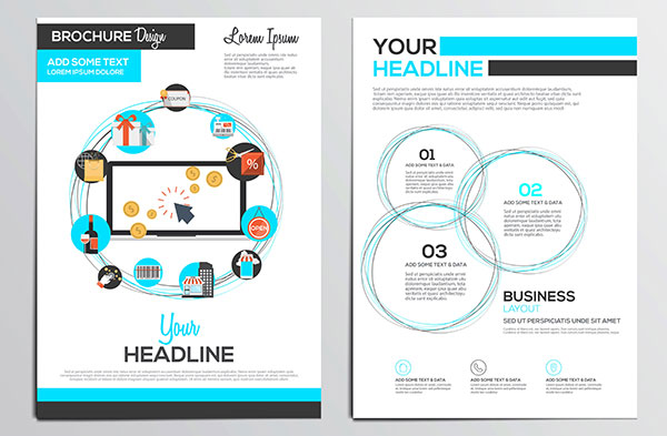
A well-made brochure can be an important part of your sales force — selling your product or company to potential clients when you’re not even there. A bad brochure can turn clients away as quickly as a good one can tempt them, so it’s important that you put out the best brochure possible. How you decide to represent your company can make the difference between looking like an amateur start-up and giving the impression of an established, responsible company.

Eye Catching Brochure Design
Design Layout
Figure out who your ideal client or customer is before trying to design anything. The entire piece should be enticing to that customer; create and print different versions if you have more than one ideal customer. Look at fonts, colours and photographs and decide whether they have a masculine or feminine feeling, and use them accordingly. The same thing goes for high end and frugal customers. Creating the right appeal is the most important part of your design.
Grab the eye with your brochure’s front page. The font, spacing, and photos all combine to make a first impression. Convey a feeling of solidity, of expertise in your industry. Choose two fonts to use on the cover and throughout the piece: one serif and one san serif. Choose two fonts that look good together, but are very different from each other.
Avoid including too much text. Show, rather than tell. A brochure is an invitation for potential clients to find out more about you, not an all-inclusive information packet. Use large photos, bright colours, larger text sizes, and a lot of white space to make your pages look airy, not crowded.
Brochure Tips
The first page of your brochure is the invitation, and the following two pages should be a broad overview of benefits customers will find when using your product or service. Let your readers know what you have to offer, but leave some room for questions so they have a reason to contact you.
The feel of your brochure can be as important as the look. You may be tempted to use less expensive paper to save money, but your invitation to potential clients is not the place to scrimp. Use a weighty stock with a substantial feel and a high quality surface. Glossy stock or recycled papers are two options that give two very different but favourable impressions
Designing and Printing Your Brochures
Creating your own brochure can be a daunting task, especially if you don’t have an artistic background. Spencer Minuteman Press is ready to take care of all your printing in Melbourne CBD. They have a professional design staff who will work with you to create your ideal brochure, and a variety of printing and paper options so you can make your brochure unique for your business. Whether you’re looking for express business cards in Melbourne, envelope printing, posters and flyers, Minuteman Press Spencer Street should be your go-to printing source.


