You know we love to talk typeface and graphics, and today we’re discussing another favourite design topic: colour trends. Colour is a powerful tool, as we’ve mentioned before in our article on marketing psychology and visual images. It’s important to think about the colour choice of everything, from your business cards to your advertisement flyers. If you want to stay on the cutting edge of the design world, you need to know the season’s hottest hues. Read on to find out more!
Pastels
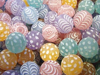
In contrast to last year’s top colour—a bold, orchid hue—the trend at the moment is definitely softer shades. Pale pinks, mint greens, and robin’s egg blues are everywhere. Often times these pales shades are paired with rich navy or black for a striking contrast.
Sherbet orange is another colour that’s at the top of the stylish list. Even richer corals and salmons are popular, and are often used as a highlight amidst lighter pastel colours.
Pastels work perfectly for just about all printing projects. They are classic and work well for both professional and personal projects. It’s also incredibly easy to read fonts printed on pastel backgrounds, making it a safe choice for posters and stationery. Stop by Spencer Minuteman Press today if you’re looking for help designing your digital printing project in Melbourne, and we’ll make sure to point out the colours that suit your needs and reflect the latest design trends.

Perles Pastel
Natural Shades
Natural shades are very big right now. Think pebble grey, the yellowy-brown of raw wood, and hazy greens that are reminiscent of dew-covered woods. These shades are soothing and peaceful, which is perfect for the chaotic world we live in, right?
This colour trend can help you choose your business cards or formal wedding invitations. Both require a certain level of austerity, and tradition would dictate you select a white background. But with the current colour trends in mind, a better choice might be to go with an almond or sand shade. Natural tones aren’t just trendy, they’re very welcoming and look quite elegant.
Classic Blue
The colour experts, Pantone, have predicted that the ‘it’ colour in the coming months will be a true, classic blue. Clearly not a pastel, but certainly less bold than a cerulean or aquamarine shade. Classic blue is also just that—classic—so it will never seem ‘trendy’, just beautiful.
Blue is found everywhere in nature, from the sky to sea. Maybe that’s why it’s consistently ranked as the world’s favourite colour? It’s so familiar to everyone, and we’re often drawn to what’s comfortable.
If you’re looking for printing services in Melbourne’s CBD that will keep you at the top of the design game, choose Spencer Minuteman Press! We love our industry and are looking forward to sharing our professional knowledge and tips with you.


