All posts by spencerprint

Paper’s Not Our Only Medium

You know that Spencer Minuteman Press offers the best printing services in Melbourne’s CBD, but maybe you’ve been wondering just how we translate a design scribbled on a scrap of paper into a professional business card. Or, perhaps you want to know how the logo our graphic designers create for you can find its way onto the headers of your MS Word templates, your web site header and your presentation covers.

Prepress Team

Spencer Minuteman Press is made up of several departments that are highly specialised in specific areas related to printing. You’re probably aware of our sales team and actual Melbourne printers, as those are the folks that you are most likely to work directly with. Our prepress team, on the other hand, are the men and women behind the curtain. They really make the magic happen by taking your project from the theoretical world and figuring out how to make it real.

The prepress team works with the latest technology to make sure your vision comes to life. We’ve written an article before on the type of computer file formats our team can work with, but they also use several other mediums as well, and they can give you your design in whatever format or formats you need. For example…

Flash drives:

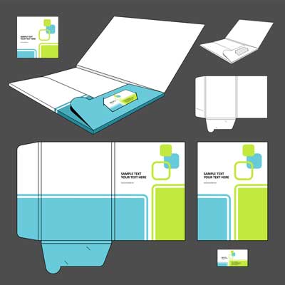
If you have a large powerpoint presentation that you need turned into handouts, a flash drive is a great way to distribute your slides to the presentees. Flash drives can also be used to store marketing materials, formatted reports and data. You can tuck them into presentation or sales folders or keep them on hand for people who request more detailed information.

CDs:

Like a flash drive, a CD can be a great way to package lengthy and complicated material to pass on to colleagues, clients and customers. While flash drives are small and easy to lose, and are therefore best included as part of a printed package, CDs can include customised sleeves and booklets with printed information.

File Exchange:

We can’t list all of the formats we work with because it would take over this entire blog! Seriously, we work with just about every piece of software out there. Acrobat, CorelDraw, Excel, InDesign… If you work with a specific type of software at your company and would like for us to create your project in a compatible format, that’s no problem at all. We often get very rough sketches from businesses and can easily flesh out the design and port it to whatever computer program you use. This makes the whole back-and-forth drafting process a cinch.


Different Mediums We Accept for Our Printing Services
Different Mediums We Accept for Our Printing Services<

Remember, Spencer Minuteman Press offers a ton of services that go beyond basic digital printing. No matter how ‘out there’ your idea seems, we know our prepress department can turn it into a beautiful reality, both on paper and electronically. Call, e-mail or stop in today to talk to our talented team!

Tips for Choosing Presentation Fonts

We recently brought you our tips for creating an outstanding presentation folder, and we want to share a few more pointers on choosing the best fonts for your presentation. There are loads of options out there, and while there aren’t ‘rules’ per se, the guidelines below will help your presentation maintain its professionalism and readability while utilising eye-catching fonts.

The Basics: Serif vs. Sans Serif Fonts

Broadly speaking, there are two types of fonts. The first is serif, and is characterised by tiny flicks at the end of each letter. In contrast, a sans serif font is not punctuated by any flourishes at the end of the letter’s lines. You will never go wrong when pairing a serif and sans serif font together, because they provide enough contrast so that readers can easily differentiate between them.

Typically, a serif font works best for large portions of text on a handout or in a slideshow. Simply pair it with a sans serif font for your headings for a sharper look. This is true for business cards, as well. Go with a serif font for your name and/or company, and choose a sans serif font for your contact information. The result will be a sleek, premium business card.

Ornamental is OK in Moderation

Any headers you use, whether they’re on a poster or folder, need to be eye-catching. Because headers are short—typically just five to eight words—it’s fine to choose a more decorative font. Make sure that your font still reflects the tone of your presentation, though. Some fonts can look childish and silly—or stuffy and old-fashioned.

The most important thing is to maintain readability. Some ornamental fonts can be difficult to read, so be sure to solicit feedback from others. You never want to sacrifice comprehensibility for style.

Find Balance

As we’ve already mentioned, when pairing fonts, you want to keep in mind that opposites attract. A heavy, bolded title on your presentation handout will pair well with a sleeker, narrower body text. Keep the fonts consistent throughout all of your presentation materials; what your audience sees on your slideshow should be the same as the fonts on the materials in the presentation folders. That being said, it is OK to use four or five different fonts, especially if your presentation is broken down into multiple parts or categories.

Make sure you keep an eye on the colours, too. It’s likely you will be using several different colours in your presentation, and it’s critical that they all complement one another. Colour wheel theory suggests you pair colours from opposite sides of the colour wheel, and we say go one step further—adjust the shades of the colours you choose. If you are using a strong orange colour, pair it with a light blue for a pleasing visual effect.


Different Font Colours for Your Presentation

Spencer Minuteman Press is expert at creating all types of presentation materials. Come on in today for the best digital printing in Melbourne!

Symmetry in Graphic Design

We’ve written articles about creating the perfect logo and using visual images to improve your business. Now we’re going in-depth about one important aspect of graphic design: symmetry. Broadly speaking, symmetry is the balance and correspondence between different things. Symmetry is a powerful tool in graphic design. It can be used to create harmony and lend an air of stability, or it can be used to surprise and excite the viewer.

Reflection Symmetry

When most people think of symmetry, a reflected image comes to mind. You probably first learnt about symmetry by creating mirror images in primary school, finger-painting an amorphous blob and then folding it in half to create a butterfly. And there’s a reason why schoolchildren learn about reflection symmetry before any other type—it’s the easiest and simplest form of symmetry.


Reflection Symmetry in Graphic Design

You might want to choose reflection symmetry in your graphic design if your priority is to make the viewer feel comfortable. As it’s a classic way to design, it makes you and your message seem trustworthy. You can either reflect the image horizontally or vertically—it doesn’t matter. The end result will be a design that’s easy for the viewer to interpret, making them likely to spend time actually looking at it and internalising it.

Rotational Symmetry

This sounds exactly like what it is: starting with an image and then rotating it less than 180 degrees. A pinwheel is an example of rotational symmetry. Rotational symmetry still helps to create a graphic design that comes across as organised and sophisticated, but it’s a little less expected than reflection symmetry.


Rotational Symmetry in Graphic Design

You might want to opt for this symmetry style in your graphic design if are planning to include a fair amount of white space. Rotational symmetry can help you to use blank space effectively, for example, allowing you to include text you want to highlight, such as your company name in the middle. If you’re looking for premium business cards that are super-effective, get in touch with Spencer Minuteman Press and let us help you create a powerful graphic design using rotational symmetry.

Asymmetry

Are you surprised to see asymmetry as a suggested symmetry style for your graphic design?! Believe it or not, asymmetry can be used strategically in really effective ways. Now, when we say ‘asymmetry’, we don’t mean a Jackson Pollock image, full of random paint splatters. Purposeful asymmetry can be used to exaggerate certain details in your graphic design, which will ensure the viewer focuses on the most important aspects of the message.


Asymmetry in Graphic Design

Asymmetry in Graphic Design

Asymmetry in design also communicates that you are a bit of a risk-taker; that you are unique. This compliments any creative field really well, but even if you are in a more conservative industry, an asymmetrical design can be seen as refreshing and inspired.

If you need help with your graphic design, then get in touch with us here at Spencer Minuteman Press, Melbourne’s best printers. We’ll be happy to help you work out the details.