All posts by spencerprint

A Set of Logos For Your Business

Are you commissioning a graphic designer to create a set of logos for you, or are you looking to spruce up the logo you already have? Today, we are going to review the different types of logos and file formats you should have at hand to maximise your logo’s versatility.


Logos For Your Business

File Formats

Always ask the logo designer for a vector file. A vector logo can be resized both larger and smaller while retaining perfect image quality. On the other hand, bitmap images can get blurry when resized. Having a logo in vector format will allow you to seamlessly move it from a tiny notepad to a huge poster, and it will look equally good on both.

Most printers and designers can work with Illustrator .eps files or web-standard .svg files. Both file types have transparent backgrounds, which means they can be used in any project without adjustment. On the other hand, a .jpg will appear with a solid white box around it, so it can’t be used as-is on a red poster. Just about any vendor can work with standard vector file types, but you may not have a program that can read them. Make sure you also get a copy of your logo in .jpg, .png or .pdf format so you can access it as needed.

Colour Choices

In addition to including at least two file formats in your set of logos, you may wish to have versions in several colour schemes or colour depths. For example, Pantone, CMYK, grayscale and black and white versions may be of use. This will ensure that your logo works on every project imaginable, whether you are creating a giant banner that needs to be seen from several metres away or tiny, sleek premium business cards.

Design Variations

It is a good idea to develop a suite of logos in different proportions. For example, you might have one that is just an image, one that also includes your company name, and one that adds a motto or location. The logos that include text will work well on letterhead and larger advertisements, while a pared down version of the logo will look best on small items like brochures and business cards. For more information on how simple is sometimes best, check out our article on using white space in graphic design.

Some companies keep versions of their logo that are square, rectangular, oblong and designed to be displayed at a variety of sizes, both online and on printed material. For example, you may need versions of the logo that will look good on LinkedIn, Twitter, Google and Facebook, and you may wish to have a standard banner graphic, as well.

In summary, a perfect logo set will include images that are in both vector and bitmap formats, with a variety of colour depth options and perhaps a suite of geometric variations. With these in your arsenal, you can tackle any project with the help of Spencer Minuteman Press, Melbourne’s best printers!

Three Perfect Occasions For Logo Notepads

Is there anything more annoying than when you need to jot down a note but don’t have a scrap of paper? Well, that frustrating feeling can mean lost business for you. Thankfully, Spencer Mintueman Press, Melbourne’s premier printers, offers custom notepads. If you work with people, chances are at some point you’ll need a notepad—whether it’s for writing down a quote, creating a loose sketch or layout, or simply jotting down a reminder. Whatever the case may be, here are three perfect occasions for a custom logo notepad. 


Custom Notepad
Custom Notepad

Conventions & Trade Shows

These types of events are all about networking and building name recognition. The more exposure your logo gets, the more memorable it will be. You truly can’t overuse your logo, so in addition to slapping it on banners and business cards, make sure you have custom notepads at your company booth. You can give them away as swag—everybody loves freebies—but they are also nice to have on hand (along with a couple of pens, of course) in case passers-by want to write something down. It doesn’t matter what the note is about, it can be the name of the bar where the after party will be. All that matters is that your company logo is getting seen.


Client Meetings

Presenting a cohesive brand to clients and potential clients is extremely important. Any time you are in a meeting with clients, make sure to set out notepads with your company logo on it for note taking. Again, even if they just use it to doodle throughout the conversation, a custom notepad is that extra special touch that shows the client your attention to detail. Just as you might set out a pitcher of water, a custom notepad helps your client feel comfortable and well cared for. They’ll see you as professional and trustworthy.

We’ve talked before about the importance of logos and how to design them. We think it’s important enough to say once again that your logo is a constant reminder of your company’s values and mission. Make sure it properly represents you, and then keep it visible during client meetings on notebooks and other documents.


Investment Meetings

There is nothing more high stakes in the business world than meetings with banks and investors. Anytime you meet with lenders, put out a custom notepad. Not only will this make you appear professional and reliable, but the logo notepad gives you an additional opportunity to remind investors of what you are trying to accomplish in a subtle but powerful way.

So often during these types of meetings, numbers are written down, exchanged and amended. Keeping track of all those digits is best done on a notepad. Technology is distracting and prone to glitches, but your custom logo notepad will never let you down.


If you’re looking for the best CBD custom printing services, come on in to Spencer Minuteman Press today! We offer the best printing in Melbourne on everything from presentation folders to posters.


I’m an Electrician, and This is the Business Card I Chose

We don’t mean to harp on you, but as we’ve shared on here before, we really believe that forgoing a business card means lost opportunities. Creating a business card is fast and easy when you use our free design tool. We have thousands of templates for you to choose from, and with our express printing services, you can be increasing your business in no time. For the best business card printing in Melbourne’s CBD, make sure you choose Spencer Minuteman Press!

Now you’re going to hear from ‘Mick’, an electrician, on how he decided on his business card design.

Mick’s Business Card Story

I’ve been an electrician for three years. I started out with a company that worked mostly in commercial settings, but liked the few residential jobs I was assigned to. There’s something satisfying about connecting with your client and really helping them to improve their life, you know? I was a young, neatly dressed guy, and I had several homeowners ask me for a business card. They were always surprised when I said I didn’t have one. It happened enough that I decided to create one, and pretty soon I had enough repeat customers and references that I left my job and started to work for myself.

Designing my business card was easy, since I used Spencer Minuteman Press’s free templates. It literally took me about 30 minutes. I wanted something that would be appealing to my clients, most of whom are busy working mums. I went with the hanging lights picture for obvious reasons, but I also figured the colours and the artsy design would be well received, and I was right. I even had a lady tell me it was such a cool image, she’d like a framed version of it!

I played around with filling my business card with things like ‘free quote’ or ‘available 24/7’, but decided it made the card look too cluttered. Just sticking with the basics lets potential clients know that I’m a straight-shooting, professional electrician. I also decided to leave out my specialties, since honestly, most homeowners don’t know the first thing about electrical wiring and the terms were lost on them anyhow.

I’ve found that my business card design is appealing to clients and easy to read, leading to loads of calls and emails. I always respond immediately, even if just to say ‘hey, I’m in the middle of a job right now but would like to discuss your issue and how I can help at X o’clock.’ I’m consistently getting positive feedback on my professionalism, and know that my business card is a part of that.


Business Card Designed by Mick

Business Card Printing in Melbourne

We can’t stress enough how important having a business card is. Like Mick, it can empower you to strike out on your own, or at the very least increase business and network effectively. If you want the best business card printing in Melbourne, choose Spencer Minuteman Press. Design your premium business card today!

Choosing the Wording For Your Wedding Invitations

Spencer Minuteman Press offers the best printing services in the CBD, but we want you to know our work goes beyond our premium business cards. We’ve already shared an article on creating the perfect save-the-date card by using your engagement photos, and today we’re tackling the wedding invitation itself. One of the trickiest parts of creating your wedding invitation is choosing the right wording. We’re about to fill you in on the basics.


Printing Services For Wedding Invitations

Money Talks

Technically, the invitation is coming from the people who are paying for the wedding. Traditionally, that’s the bride’s parents; therefore, the invitation should start out:

Mr & Mrs Bryan Flandry [invite you to the wedding of]…

Of course, any iteration of that is fine. For example, both parent’s full names can be used, dropping the titles if the event is casual. The bottom line is that having the invitation coming from the bride’s parents is a clear indication that they are hosting the event. So what if they aren’t paying for it?

You’ve probably already guessed, but you simply go with the names of the hosts. If that’s the paternal grandparents, they get top billing. Nowadays it’s very common for the bride and groom themselves to pay for the event, in which case it’s their names. Most couples still want their parents’ names on the invitation, though. Here’s how to make that happen:

Please join us in celebrating the marriage of
Rachel Flandry
daughter of Bryan and Melissa
to Nathan Thompson
son of Samuel and Laurie

Can you believe this is actually the easiest part? Let’s take a look at what comes after the hosts’ names…

Religious vs. Secular Ceremony

There are two main ways to word the invitation, and they are dependent on whether the ceremony will be held in a house of worship or if it’s a non-religious ceremony. If you will be having your wedding at a church, synagogue, or even outdoors but with a full religious service, the initiation should say:

Mr & Mrs Flandry
Request the honour of your presence

This exact phrase alerts attendees that this will be a religious ceremony, helping them to dress appropriately and generally be prepared for the event.

A secular ceremony has a bit more flexibility with the wording, but will be something along the lines of:

Mr & Mrs Flandry
Request the pleasure of your company

Other Phrases

Honestly, the opening line is pretty much your only chance to inject some personality into the invitation. Everything else on the invitation will be the event details: the date, time, location, and names of the couple/their parents. Let’s look at a few more ways to word the all-important opening line:

  • ‘Ask you to join us in a celebration of love’
  • ‘Invite you to witness the marriage of’
  • ‘With joyful hearts, ask you to attend the wedding of’
  • ‘Want to party with you!’

When you’re ready to start designing your invite, get in touch with Spencer Minuteman Press for the best digital printing in Melbourne.

Local Retailer? Here’s Why You Should Print and Distribute Brochures

An effective marketing campaign utilises many forms of media, from radio spots to online advertisements. As Melbourne’s premier printers, we’re partial to posters. But here’s why we think brochures are key: they cost very little to produce and print, but stick around a heck of a lot longer than a 20 second radio blurb or internet ad. Brochures are eye-catching and far-reaching. If you’re a local retailer in Melbourne, you should create and distribute one ASAP.


Brochure Printed by Minuteman Press Spencer Street
 

Spread the Word

Your brochure should not be overfilled with information. A wordy or fussy brochure will instantly put people off. You want to make sure you curate the information to highlight the most important aspects of your message. Approach it like an assignment from primary school and start with the 5 Ws:

  1. Who you are: Make sure your business name is in a prominent location. Place it on every page.
  2. What you do: Explain as briefly as possible what type of business you are in. Think here about speaking directly to your target demographic.
  3. When: If you are advertising a specific event or limited time promotion, make sure that’s clear.
  4. Where: In addition to your address, also include your company URL, as well as phone and email information.
  5. Why: This is the most important one. Explain why your audience should care about this. What’s in it for them?

Weigh the Options

As we’ve already said, brochures are economical. Spencer Mintueman Press has a range of brochures for every budget, but you should always go with the highest quality you can afford. The reality is that a brochure printed on a shiny, thick paper will convey a sense of luxury. Invest just a little bit more on the paper quality and you’ll see that the public will be more likely to invest in YOU.

You also have to consider where you will be placing your brochure. If this is something that will be going into neighbourhood mail slots, you can be sure it will be noticed. However, if you plan to leave this with other businesses—coffee shops, dry cleaners, and the like—you will want to go with something a little flashier. That might mean choosing brighter colours for your background or images, or picking a paper that has a glossy finish.

Not Just a Mini-Catalogue

Don’t underestimate just how versatile brochures can be. You don’t have to use them to directly sell your business, but you can treat them like content marketing instead. For example, if your retail store sells coffee, create an interesting informational brochure on how exactly coffee beans are sourced, roasted, and eventually turn up in your cup. Your clothing store can create a brochure on the hottest celebrity trends for summer.

Ready to create a brochure of your own? Take a look at our article on font basics, and then stop by Spencer Minuteman Press for the best digital printing in Melbourne!

I’m a Family Doctor, and This is the Business Card I Chose

You already know that Spencer Minuteman Press creates the best premium business cards in Melbourne’s CBD, but did you know we can express print and even deliver your cards? We know that certain professions simply don’t have the luxury of time, and it’s important to us to be accommodating.

One of the most demanding fields is medicine, and there are no doctors busier than family practice physicians. Today, we’re bringing you the story of how one doctor chose her business card.

On Marketing

I was called to medicine from a young age, well before I finished school and went on to uni. I sailed through my courses and medical training, but I never had any instruction on marketing. The reality is, though, that physicians have a great need to network and become visible within the community to build up clientele. Word-of-mouth is a great way to connect with patients, but nothing beats a good old fashioned business card.

The Basics

As a family doctor, it is important to me to appeal to all age groups and genders. I also want to communicate my values and let potential patients know the benefits of choosing me as their doctor. What I pride most about my practice is that while I use cutting edge techniques and have received a modern, advanced medical education, I believe in classic care. To me, that means preventing illnesses instead of covering up symptoms, and treating a whole person and not just a localised issue.

It was also important to me that I choose a business card that conveys I’m an attentive, caring doctor. In today’s chaotic world, finding a physician that takes the time to listen and connect with patients is rare. That’s something that sets me apart, and I want to make sure that is clear on my business card.

Why This Design Works

This business card is simple enough to let my contact information stand out, but the bright red is eye-catching. The heart and hand signify the gentle, thorough care I give all of my patients. It looks trustworthy and comforting.

I have gone with a glossy laminate finish, which is of excellent quality and lets potential clients know they are getting the best when they choose my family medical practice.

Well, there you have it. For more tips on choosing and printing the right business cards for your medical practice, take a look at our article on the beauty of classic business cards. Check out the thousands of free templates at our website, or for a custom business card, get in touch with Spencer Minuteman Press and talk with one of our designers. A great business card is definitely a prescription for success!

The History of JPEG

As well established Melbourne printers, we know how to work with all kinds of computer file formats. If you’ve ever opened a picture on a computer, you have probably heard one or more of the following acronyms: JPEG, TIFF, or PICT. Today we’re covering JPEG and other image file formats to help you better understand what those letters mean.

What is a JPEG?

JPEG is the most common format for images, and it has been around since the early 1990s. JPEG filenames end with .jpg or .jpeg.

A single digital image is made up of thousands of pixels, which get compressed when the file is saved as a JPEG. The format was developed to reduce the size of images, which can take up a lot of disk space on computers. In a jpeg file, the compression only affects the number of pixels, which is related to clarity, but doesn’t distort the colours.

It is true that the compression process can result in a loss of data, but it’s unusual for that loss to be visible. If a very large image is compressed too much, it can look fuzzy or jaggy, but with a small logo image for your business card (for example), you probably won’t be able to tell the difference between the original digital image and the compressed JPEG file.


Image Quality Loss Due to Compression

It should be noted that JPEG files cannot save layers, meaning that you can’t superimpose or move images about in a scene.

What About PICT and BMP Files?

The PICT was the original bitmap image file format on Macintosh computers. PICT files are typically smaller than other file formats, but of course there’s a catch. As mentioned above, the compression process for JPEGs doesn’t distort its colour at all, but PICT files rely on an internal algorithm for compression that affects both the number of pixels and sometimes their colour.

Like JPEG files, PICT files cannot include layers. Keep in mind that to this day, many computers operating with a Windows system can’t open PICT files. Windows has its own bitmap file format: BMP. BMP files are not compressed and tend to be large.

Last But Not Least, the TIFF

TIFF was one of the first image file formats, and it’s still going strong. Early TIFF files were uncompressed and took up a lot of memory and storage space, making high resolution TIFFs difficult to work with. Today’s TIFF files lose no data when compressed, making them popular with graphic artists and other visual designers. Generally speaking, a TIFF will maintain the quality of an image. Of course, as you probably guessed, this does mean the files are larger than JPEGs. Large TIFF files are generally more resource-intensive, larger to store and difficult to send via e-mail, but if you are creating a large poster, it’s probably worth using those extra megabytes.

When you’ve got your image saved in the format you’d prefer, stop on by Spencer Minuteman Press for the best printing services in Melbourne!

Tips for Choosing Poster Fonts

We offer the best printing in the Melbourne CBD, so we’ve helped create many, many posters. Believe it: fonts can make or break your poster. You want to choose a font that conveys a message and reflects your visual design strategy. You don’t want your font to blend in—the typeface itself should work for you. Here are some broad categories you may want to consider.

Artistic

A lot of serif fonts have an artistic look to them, and calligraphy-inspired fonts always come across as artistic. Choosing this type of typeface for your poster conveys that you are creative and detail-oriented. Artistic fonts are unique and stand out for their beauty, but they still maintain the utmost professionalism. Just make sure the font is still readable—anything too swooping can be difficult for the viewer to decipher, even at a large scale.


Artistic Font
Artistic Font

Note that most artistic fonts look best in basic black. Our guess is that if your poster has an artistic visual design, you’ll be using a variety of colours and complex images. Bold, solid black will simply stand out the best.

Modern

Modern fonts are usually sans-serif and can be described as geometric. Boxy letters with clean lines of unusual weights are definitely modern. If you want your poster to communicate that you are cutting-edge and on-trend, opt for a modern font. Especially if your poster is an advertisement, modern fonts will let the reader know you are results-oriented.


Modern Font
Modern Font

Modern fonts work well in nearly every industry. The only tricky thing about using them is mixing them with other typefaces, because they are often bold and can upstage daintier fonts. If you are mixing and matching fonts on your poster, just be sure to choose a secondary typeface that can stand up to the drama of your modern title font.

Retro/Vintage Inspired

Currently, retro and vintage-inspired text is very popular, especially those typefaces that are reminiscent of the glitzy 1920s. Some retro fonts convey a feeling of nostalgia and simplicity, while others have a distinctly more posh feel. What both have in common is a sense that you value tradition; that you’re classic and sophisticated. Retro and vintage fonts will instantly make you seem trustworthy. It’s important when using this type of font that you match it to the rest of your poster’s visual appearance. In most cases, an abstract graphic design won’t complement a retro font well. Stick with timeless visuals and colours, like blues, reds and recognisable images.

Vintage Font
Vintage Font

Remember, fonts communicate more than the actual words they form. Take time to reflect on the purpose of your poster and what implicit messages you want to convey to the reader. If you haven’t already, make sure you read our previous article on font basics. Then, all you have to do is start searching for a font that fits your visual design. If you’re looking for design help, come by Spencer Minuteman Press for the best CBD printing service!

Resolution, Explained

Minuteman Press loves getting technical. We’ve shared information on computer file formats, going into detail about the differences between bitmaps and vectors. Resolution is one of those things that you probably have a vague idea of, but a thorough understanding is critical to ensure your graphics and images look great on your website AND enlarged on a poster.

The Basics

Digital images are made up of a myriad of small, square dots called ‘pixels’. These pixels come in different colours and densities. Essentially, that’s what resolution is: how many pixels are in an image per unit area. Low resolution means that an image is created out of very few pixels. Nearly all images you look at on a screen are low resolution. You might have noticed that if you zoom in on an image on your phone or computer it begins to look blotchy. That’s because you can see the pixels that make up the image when you enlarge it.

When you print images, the resolution has to be much higher to ensure those pixels remain undetectable. A photograph might look great on your smartphone, but the minute you try to print it out for framing, it can start to appear fuzzy and pixelated.

DPI and PPI

An image’s resolution is defined in Dots Per Inch (DPI), or Pixels Per Inch (PPI). These measurements mean exactly what they sound like they would: the number of pixels per linear inch. Because computer imaging was pioneered in the US, it’s standard to use Imperial units when describing resolution. The higher the number, the higher the resolution and therefore, the better the quality of the image.

DPI is often used to refer to images intended for printing, while PPI more often refers to the resolution of an image on a computer screen. Just to give you a basic idea, most electronic screens are around 90 PPI, whereas a high quality printed image should be at least 300 DPI.

Figuring Out the Resolution

So, the custom graphic design your company uses on your website and business cards needs to be enlarged and printed onto a banner. You’ll need to check the resolution first to make sure it is high enough. You can find the resolution of an image in a couple of different ways, depending on the file type.


Different Image Resolutions
If you can open your image in a photo editor like Photoshop, the menu will give you an option of ‘image size’ or ‘image properties’. For images online, you should be able to right click and ‘inspect image’ to get the resolution. If the only information you can find relates to the size of the file—usually given in kilobytes or megabytes, keep in mind that the larger the file, the higher the resolution.

If you’re looking for digital printing in Melbourne, choose Spencer Minuteman Press. We can help you understand and work out any problems you might be having with image resolution.

Using a Template For Your Newsletter

Spencer Minuteman Press knows how important time is, and we proudly offer the fastest printing services in the CBD.

You know that time is money, so stop wasting it! If you need a newsletter for your organisation, then start with a template rather than designing it from scratch or hiring someone to do so. The design and formatting of your newsletter will be included in the template, and using a template simplifies the layout, too. All you have to do is tweak it so that it meets your needs.

Using a template turns a task that requires a professional designer into something that can be done by anyone who knows how to use a piece of page layout software like Adobe Indesign, QuarkXPress or even Apple Pages.


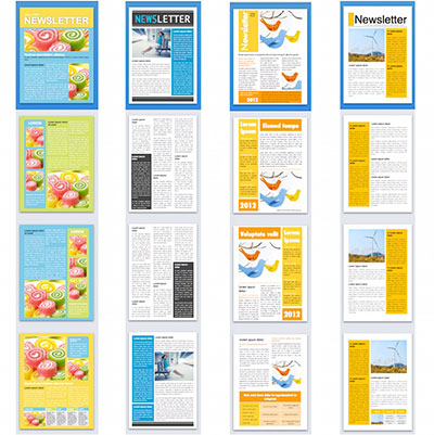
Newsletter Templates

Choosing a Template

Free and inexpensive downloadable templates are easy to find. You can run a basic internet search and get thousands of great options, or try checking out sites like Pinterest. Search for a template with a few keywords, like ‘free’, ‘classroom’, or ‘summer’, and include the name of your software in your search, too. Once you find a template you like, you can adapt it to fit your content; it’s much faster and easier than doing the design from scratch. If you’re in a hurry and you’re producing all the content, then you can even make the content fit the default layout.

Make sure your template matches your organisation; it needs to be a suitable, easy to read design. Good templates will come with a set of layout options that you can choose from and then change to match your needs. So, for each page, you’ll be able to make a few changes rather than coming up with a whole new layout.

The purpose of using a template is to save you time. Don’t choose a template that will need significant alterations to meet your needs. When in doubt, go with a basic design.

Maybe a Notification is All You Need?

If your newsletter content is very short—perhaps it’s simply notifying customers of expanded hours or product options—consider using a postcard instead. People are much more likely to read your notifications if they are short, so if you can boil down the main points of your newsletter to fit on a single card or flyer, all the better. You can find a ton of free templates using our online design tool. On the other hand, if you want your newsletter to be just a letter without any pictures or fancy borders, we also offer templates to help you create professional letterhead.

As Melbourne’s premier printers, we know that quality is key. Using a template in no way compromises the integrity or professionalism of your newsletter. In fact, in our experience, most templates are superior to anything that an amateur designer, even a talented one, can produce in a reasonable amount of time. For more newsletter tips, check out our article, Let’s Talk Newsletters.